The evolution of a cover
By Michelle Milburn
-------------
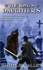
1. This cover was a bit of an experiment for me with using photomanipulation as a tool in digital painting. I started out with a sketch that was a combination of photo and drawing. At this point I was primarily concerned with keeping unity with the first two covers, which both included two figures (one of which was Amir) in the foreground. Each book also has a unique cultural setting, which is depicted in the background.I used the first book's cover as a guide for the size of the title text, as well as a little bit of colour (mostly whited out in this first image.) I wanted an arrangement of the two figures in the foreground to be similar to book two's cover, which has Amir facing off against a bear. However, this time I wanted Amir to face forward, while I thought one of the book's antagonists (Mokoi) would make a good imposing figure in the foreground. The setting for book three is an Asian-inspired travelling city, so this was the natural environment for the two figures. At this point I'm just playing around with the elements, which at this point are as visually disimilar as they can get. My Amir placeholder is a ridiculous-looking little blob, so...

2. ...let's sketch him a little more presentably. Also, adjusted the ratio to fit the Kindle, though I left some sky space above this in Photoshop so the book can be used with other ratios as well. After meeting with Nathalie I sought out some specifically Korean roofs for the buildings. Since roofs are one of the most striking features of Korean architecture, I thought I should take advantage of this feature when depicting the book's setting. I am taking roofs from some photos and adding them to buildings from other photos to make new buildings, then drawing what I need on top. (Notice the guy with the backpack on the left. He is going to go when I begin painting.) Also, the buildings have been rearranged.

3. Buildings still shifting a bit, though not as much as before. Also, we need more atmosphere here, and the right hand side of the picture is looking really heavy to me at this point. I love the colours of the sky in book one, so I temporarily reveal them by erasing my Photoshop "whiteout" where I feel the sky could be darker. I will repaint the sky later (don't want to steal!), but these are the colours I'm interested in using and I'm just playing with composition.

4. Buildings painted. The clouds are painted with a custom cloud brush I created using Photoshop's brush editor.

5. Amir gets his final makeover, and Mokoi gets a few touchups as well.

6. The picture is a little dark, so let's brighten it up and add titles. Also, Amir was previously holding a sabre, but in the book he's described as wielding a rapier, so I fixed that. Add the title and byline, and we have a cover!


2 comments:
How fascinating to see the evolution of this cover; I love it!
Thanks, guys!
I find it facinating too, covers being so important now. I'm glad Michelle agreed to write it.
Post a Comment